SQL to Graph Example
The easiest way to learn SQL‑driven graph generation is by example. The 15 - Using SQL - World Map sample in the samples folder will guide our walkthrough of the sql worksheet.
Our goal is to create a logical world map by graphing each country, linking it to its continent, and assigning a distinct color to every continent.
The SQL - World Map directory contains:
- A copy of the Relationship Visualizer workbook with SQL statements already defined
- Preconfigured styles on the
stylesworksheet - A
countries.xlsxworkbook containing the data we will query
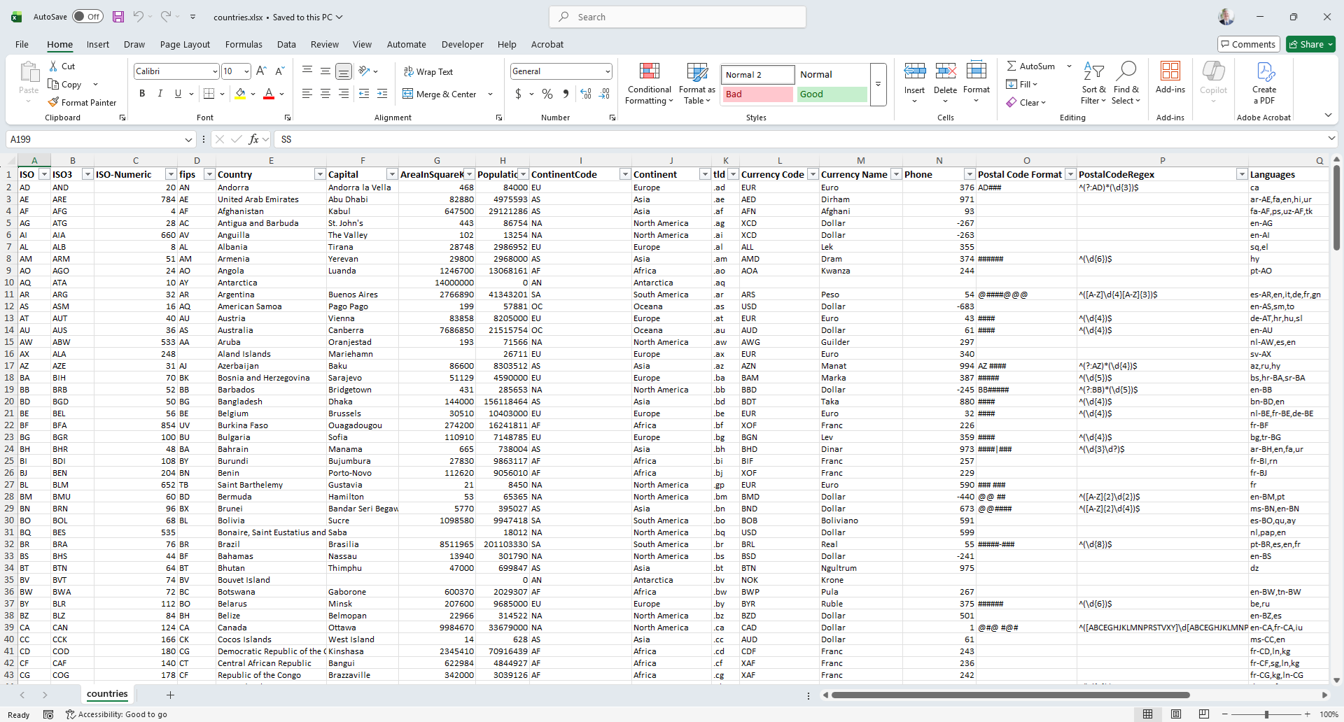
An example of the countries workbook appears as follows:
Style Elements
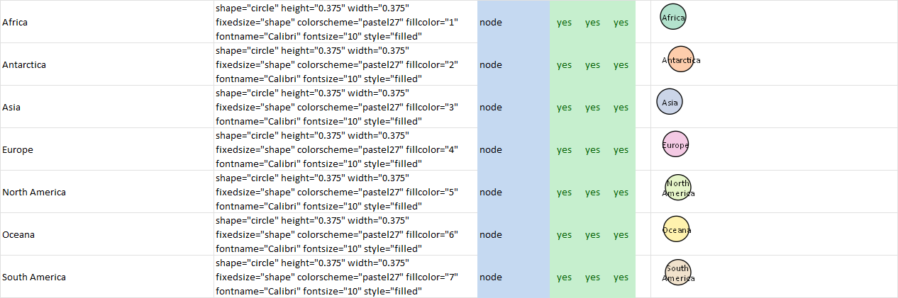
If we file on the Continent column we see there are 7 continents.
Using the Style Designer we create a unique style for each country by assigning different Fill Colors. The styles are stored on the styles worksheet using the Continent Name as the Style Name.
This snipped from the styles worksheet shows the 7 node style definitions which correspond to the continent names.
Building the SQL Queries and Directives
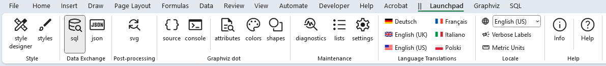
Next, open Relationship Visualizer.xlsm workbook. From the Launchpad ribbon tab select SQL.
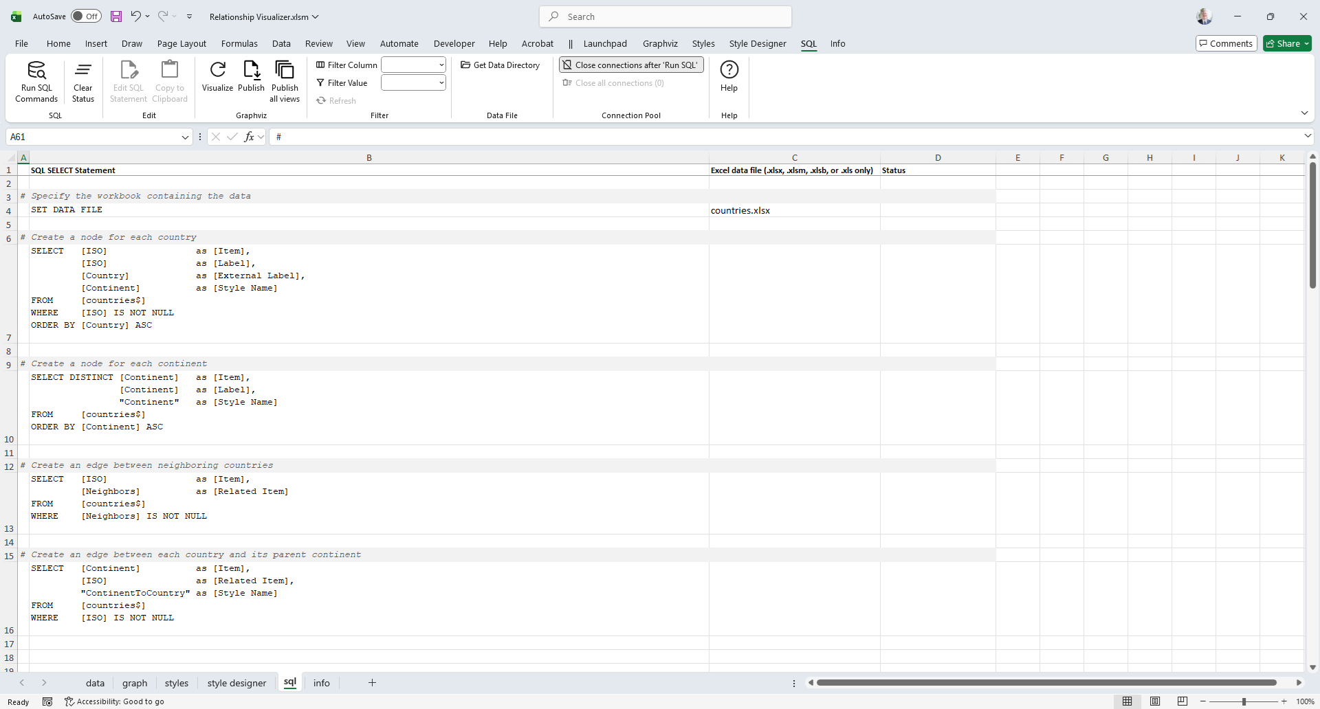
The sql worksheet will appear. You’ll rows containing SQL statements, and some additional directives which. These queries extract values from the countries workbook and are used to generate a graph showing continents, countries, and their shared borders.
The sql worksheet appears as follows:
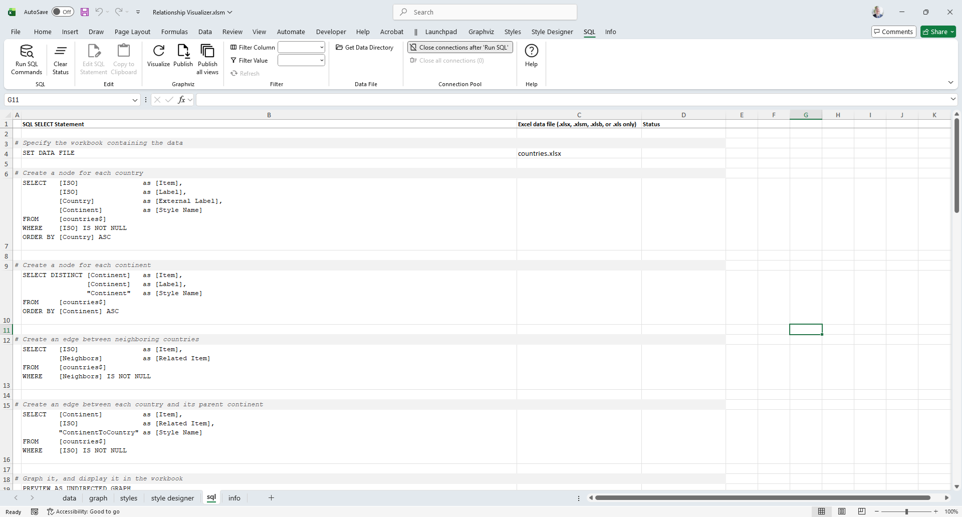
Specify the Data Source
The first directive statement on row 4 is SET DATA FILE. It informs the Relationship Visualizer to use the file specified in column C (countries.xlsx) to be the default data source.
Create the Country Nodes
The first SQL statement on row 7 selects the column ISO to represent the Item, as well as the node label. The Country name is selected to be an External Label, and the Continent name is selected to be the Style Name.
The SQL is written as follows:
SELECT [ISO]       as [Item],
       [ISO]       as [Label],
       [Country]   as [External Label],
       [Continent] as [Style Name]
FROM  [countries$]
WHERE [ISO] IS NOT NULL
ORDER BY [Country] ASC
Create the Continent Nodes
The second SQL statement on row 10 will extract the 7 seven unique continent names from the list of countries by using the DISTINCT clause. The Continent name will be used as the Item ID as well as the node label. A Style Name of Continent will be used for all the rows.
The SQL is written as follows:
SELECT DISTINCT [Continent] as [Item],
                [Continent] as [Label],
                'Continent' as [Style Name]
FROM [countries$]
ORDER BY [Continent]
Create the Country-to-Country Edges
The third SQL statement on row 13 creates edge relationship rows by selecting the ISO value as the Item ID, and the Neighbors column as the Related Item value. The Neighbors column in the source worksheet contains comma-delimited ISO values which are neighboring countries to that row. The Relationship Visualizer has built-in logic to expand the comma-delimited list into multiple relationships. No style name is provided, so the default edge style will be used. Note that on the WHERE clause the directive IS NOT NULL has been added. This clause causes the query to skip rows with empty cells, as there are no values with which to express relationships.
The SQL is written as follows:
SELECT [ISO]       as [Item],
       [Neighbors] as [Related Item]
FROM   [countries$]
WHERE [Neighbors] IS NOT NULL
Create the Continent-to-Country Edges
The fourth SQL statement on row 16 is used to group countries by continent. It creates edge relationships by placing the Continent name as the Item ID, and the ISO country code in the Related Item column. The Style Name is specified as ContinentToCountry which has been defined as an invisible edge.
The SQL is written as follows:
SELECT [Continent]          as [Item],
       [ISO]                as [Related Item],
       'ContinentToCountry' as [Style Name]
FROM [countries$]
WHERE [ISO] IS NOT NULL
Run the SQL Queries
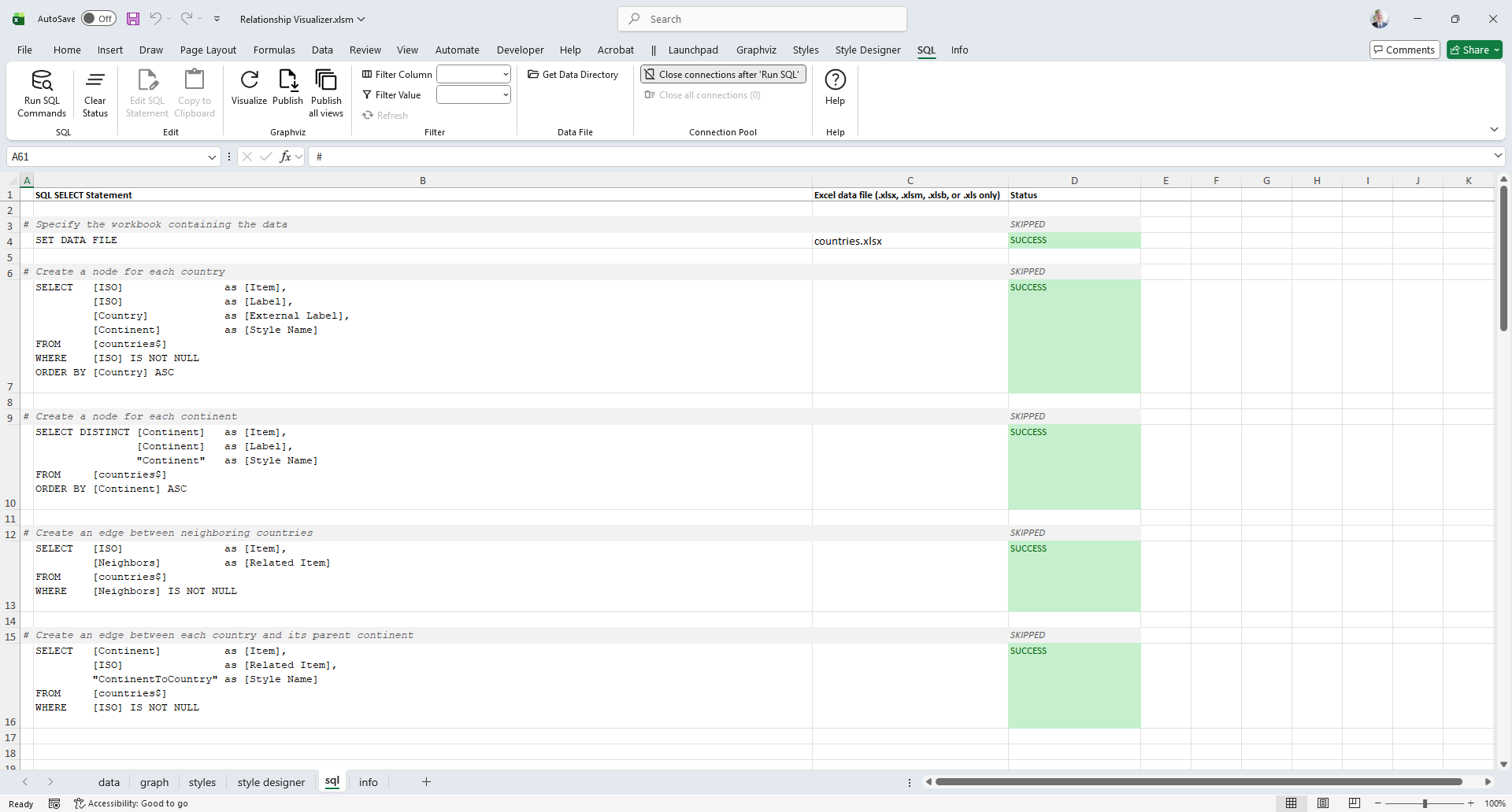
At this point our queries are complete. Press the Run SQL Commands button.

The SQL commands are run in sequence from top to bottom. Results are written to the data worksheet, and the query result status is displayed in column D such as:
If we switch worksheets to the data worksheet, it appears as follows:
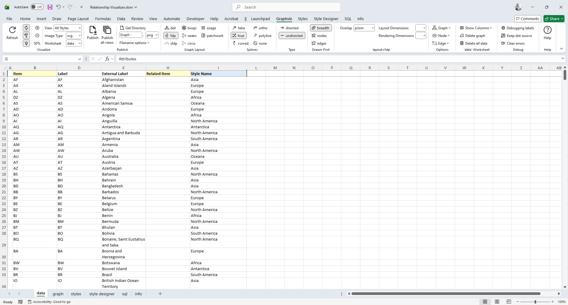
The data is all present and in the appropriate columns for graphing. In this example 678 rows of data have been created using 4 SQL statements!
Graph the Data
Press the Refresh button to graph the data. Since this is a large data set, be prepared to wait a little while for the results.
When Graphviz completes its work, you should see a logical world graph which appears as follows :
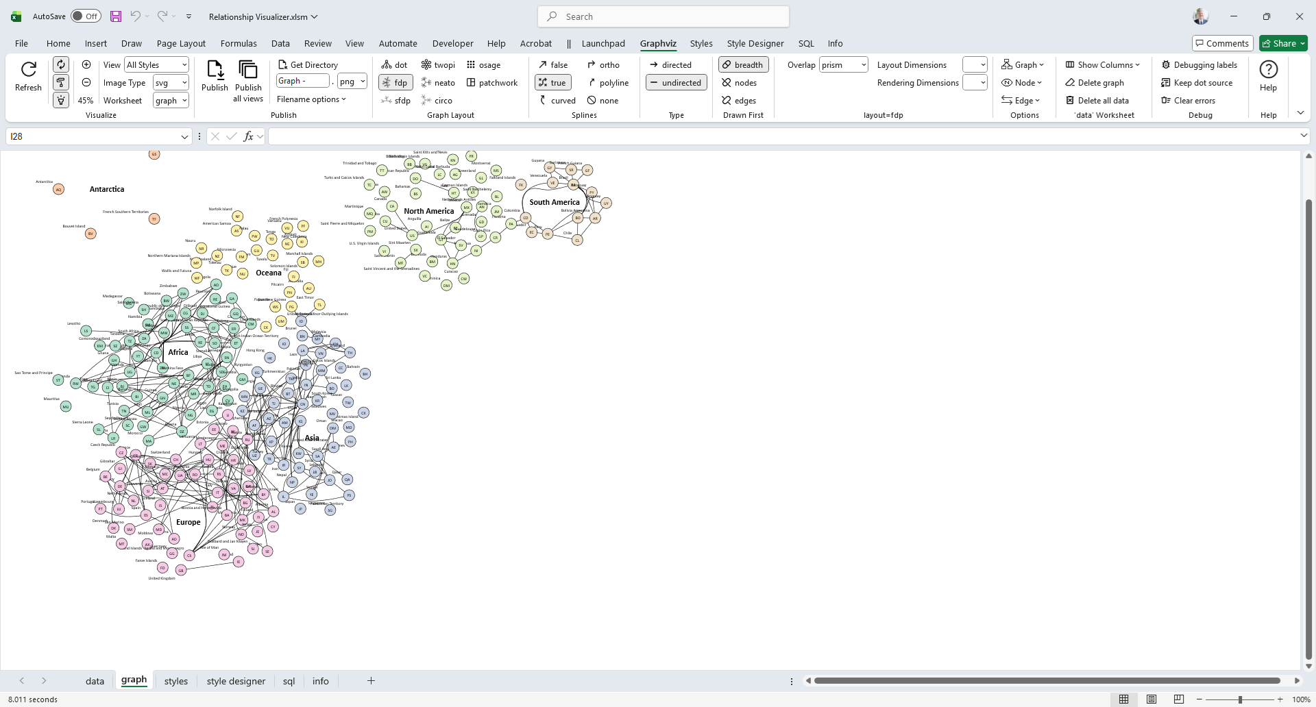
Options used: Worksheet = graph, Zoom = 45%, layout=fdp, splines=true, graphtype=undirected.
In a few short minutes we have gone from tabular Excel data to a graph visualization.