Overview
See how the Relationship Visualizer turns raw data into clean, meaningful graph diagrams, with styles, views, and publishing built into the workflow.
This quick 2-minute video gives a feel for what's possible.
Ready to explore further?
Use the cards below to jump straight to examples by topic.
Building the Graph
Get data onto the page and shape the layout.
Styling
Apply consistent styles and control visibility.
Learning & Reference
Learn dot, troubleshoot, and tweak settings.
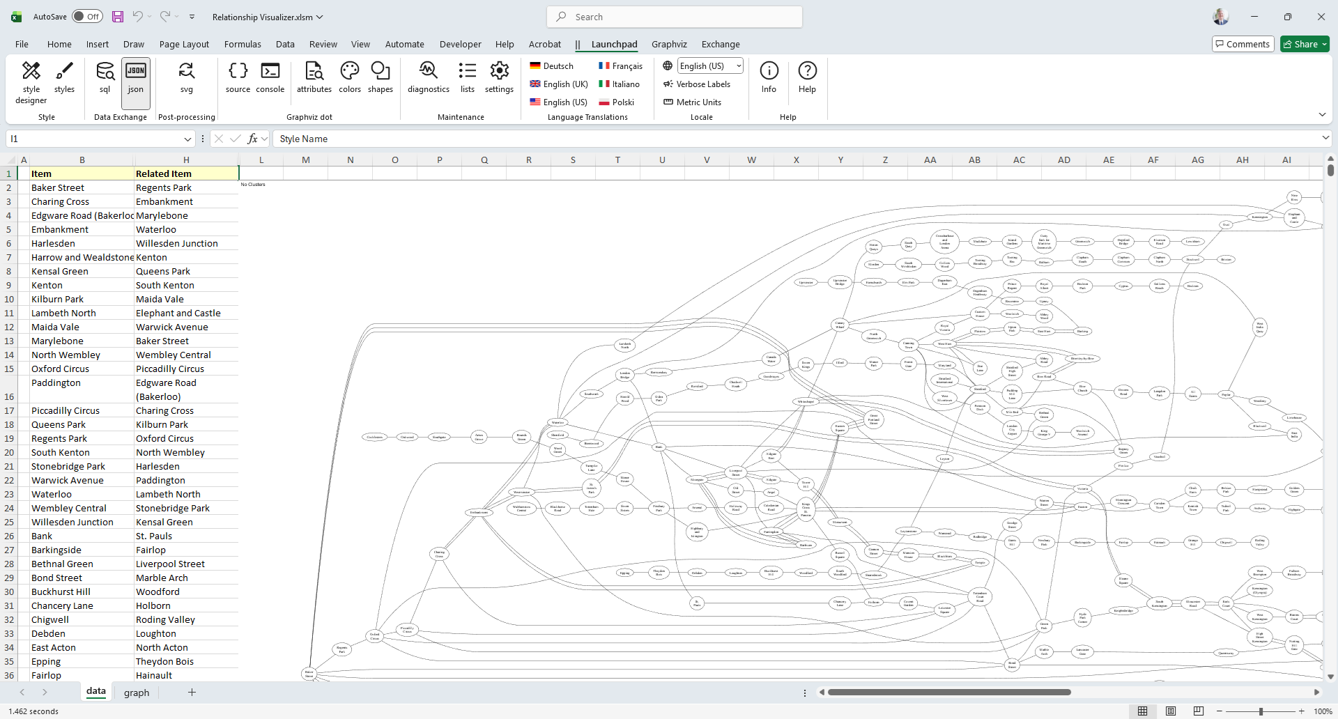
Enter Data
The data worksheet is where you specify the relationships to be graphed.
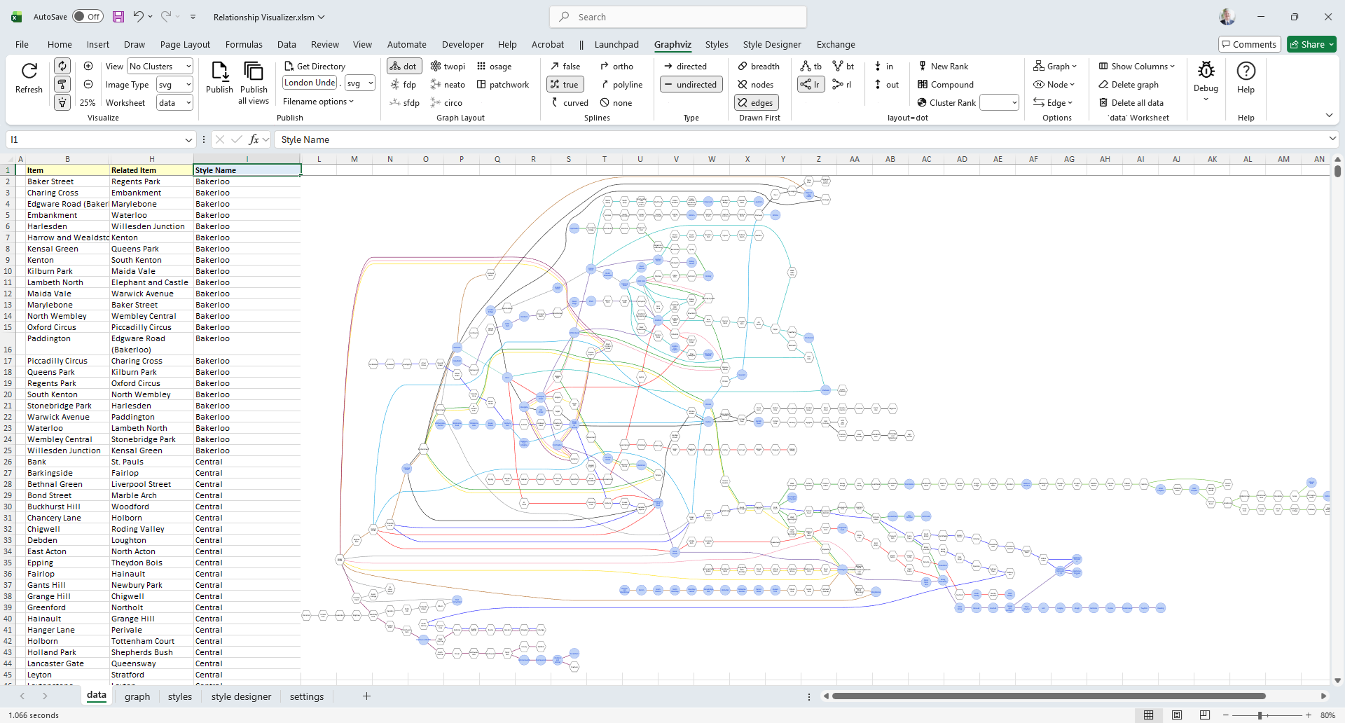
Large data-driven graphs can be constructed easily by simply supplying two columns of data, as shown below:
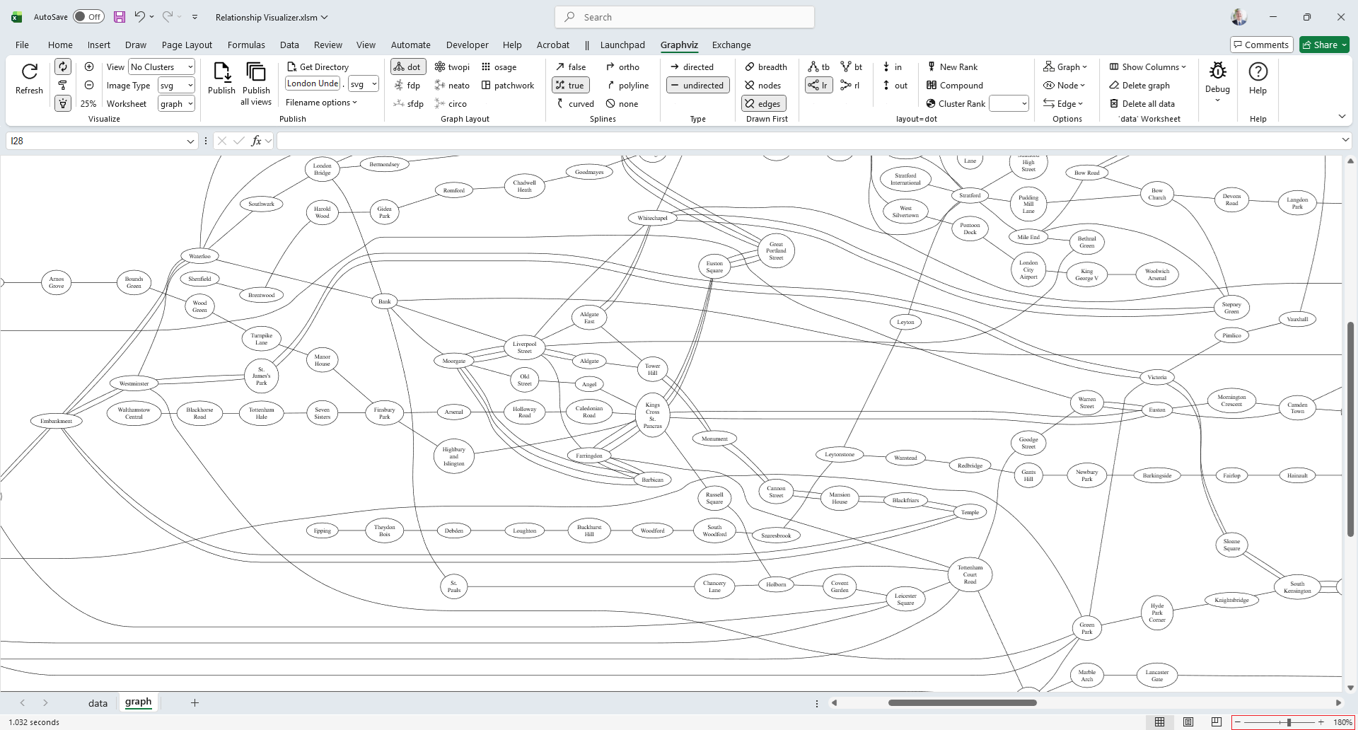
Display Graphs
The Relationship Visualizer leverages Excel's zoom in/zoom out, and scrolling capabilities to display graphs in a graph worksheet.
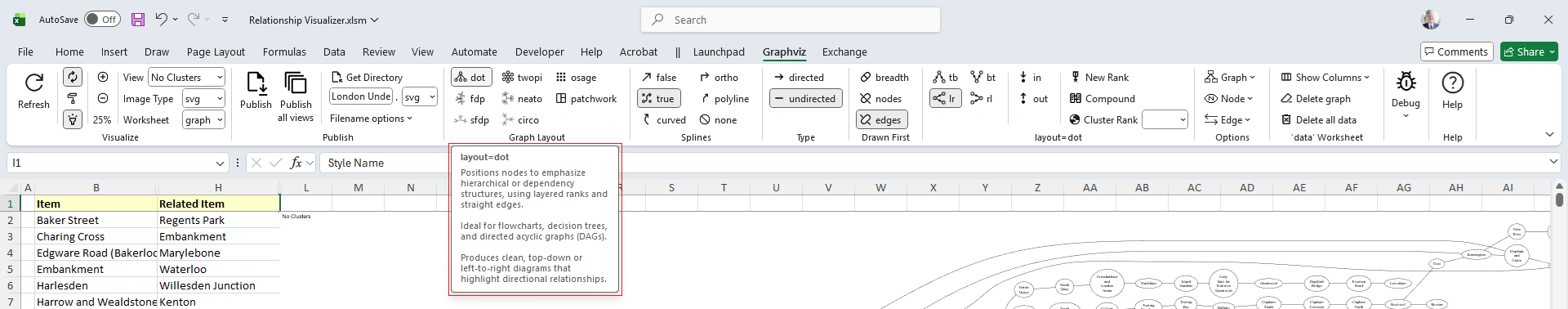
Choose Graph Options
The Relationship Visualizer enhances Excel's menu bar and provides all its User Interface controls through Excel's Fluent UI Ribbon tabs. Each control offers robust screen tips, providing helpful information when you hover the mouse over it.
Here is the screen tip displayed when the mouse hovers over the dot layout control.
Changing Graphviz options in the Ribbon Tab allows for different Graphviz interpretations of the data. Let's explore examples of Layout, Graph Direction and Edge Appearance.
Graph Layout
The layout attribute selects the Graphviz engine that arranges your graph. Different engines use different algorithms, producing distinct structures and visual styles.
Graph layout can be selected with a single button click.

Choices include:
| Button | layout= | Button | layout= | Button | layout= |
|---|---|---|---|---|---|
 | dot |  | twopi |  | osage |
 | fdp |  | neato |  | patchwork |
 | sfdp |  | circo |
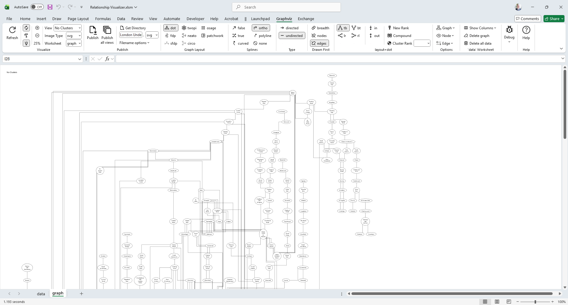
Edge Appearance
The splines attribute controls how Graphviz draws edges between nodes. It determines whether connections appear as smooth curves, straight segments, orthogonal lines, or are omitted entirely.
You select how edges are drawn using the Splines buttons.

Choices include:
| Button | splines= | Button | splines= |
|---|---|---|---|
 | false (alias=line) |  | ortho |
 | true (alias=spline) |  | polyline |
 | curved |  | none |
This images shows the previous graph with the edges changed from true, to ortho, which causes straight lines with 90 degree corners.
Graph Direction
The rankdir attribute controls the overall direction in which the graph is laid out. It tells Graphviz whether to arrange ranks from top to bottom, bottom to top, left to right, or right to left. Changing this setting rotates the diagram's flow without altering the underlying structure of the graph.
Graph direction can be selected with a single button click.

Choices include:
| Button | rankdir= | Direction |
|---|---|---|
 | tb | Top to Bottom |
 | bt | Bottom to Top |
 | lr | Left to Right |
 | rl | Right to Left |
Here we see the direction of the previous graph has changed from Left to Right, to Top to Bottom.
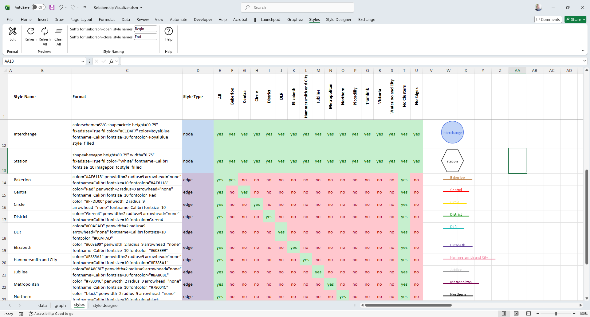
Design Styles
The Relationship Visualizer makes it easy to create combinations of Graphviz style attributes which can be applied to nodes, edges, or clusters. It provides a style designer worksheet to define the styles, and a styles worksheet to provide a gallery of styles which can be selected for a given row on the data worksheet (similar to CSS on HTML).
Here the style designer is being used to create a style of edge which is dark green (Green4) in color, and does not have an arrow head.
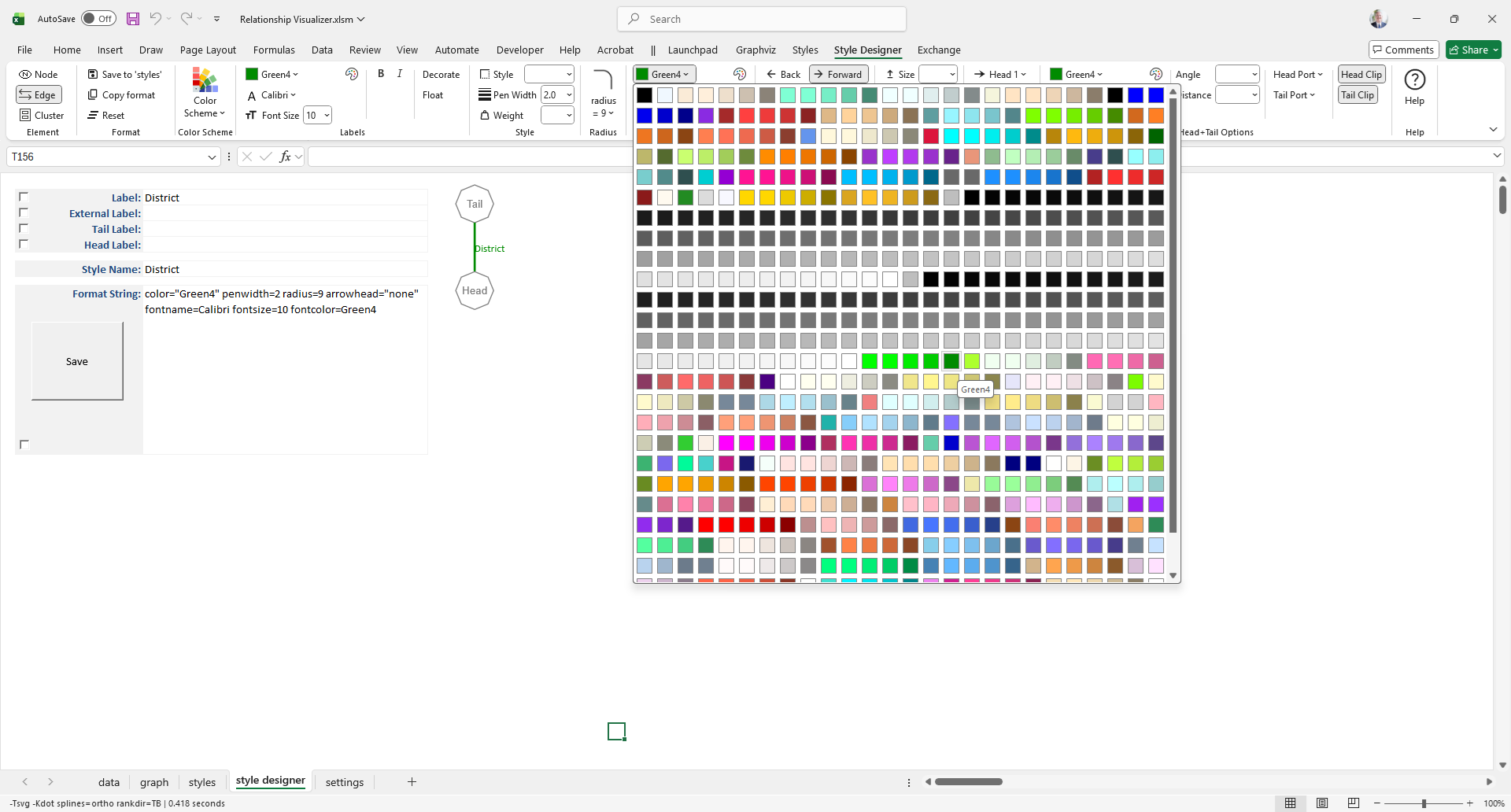
Save Styles
The Green Line on the London Underground is the "District" line. We click the Add to 'styles' button. On the styles worksheet the format string is saved on a row named District along with a preview image showing what the format string looks like.
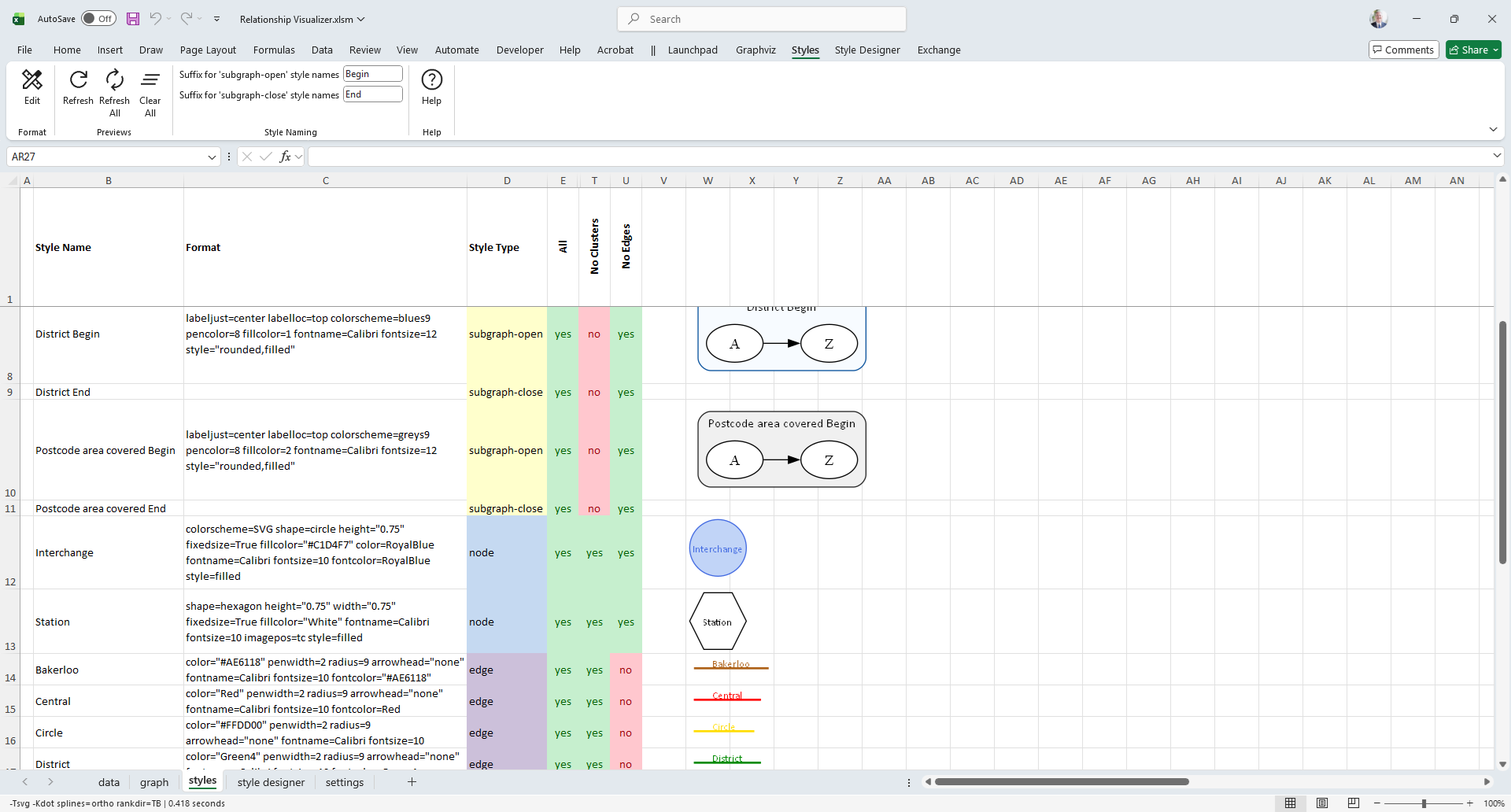
Notice that Style Names have been created for each of the subway lines, and set to their designated color. We will see them used just ahead.
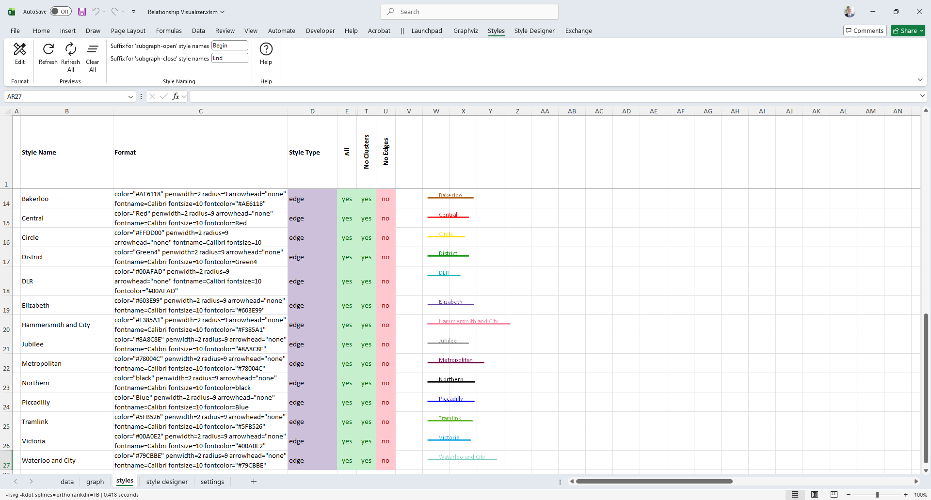
Cluster and node formats are created in similar fashion. This image shows the other elements which have been defined to depict the London Underground. For example, stations are depicted with a square shape, and interchanges are depicted by a circle.
Apply Styles
Styles are applied to data rows via a Style Name column on the data worksheet. Style Names selected from a dropdown list populated with the names on the styles worksheet.
In the image below each subway line is now depicted in its assigned colors, and shapes imply if a stop is a regular station, or an interchange.
Cluster Elements
The Relationship Visualizer lets you easily cluster nodes by adding rows containing { and } at the start and end of the cluster respectively. Clusters can have assigned styles, and clusters may contain other clusters.
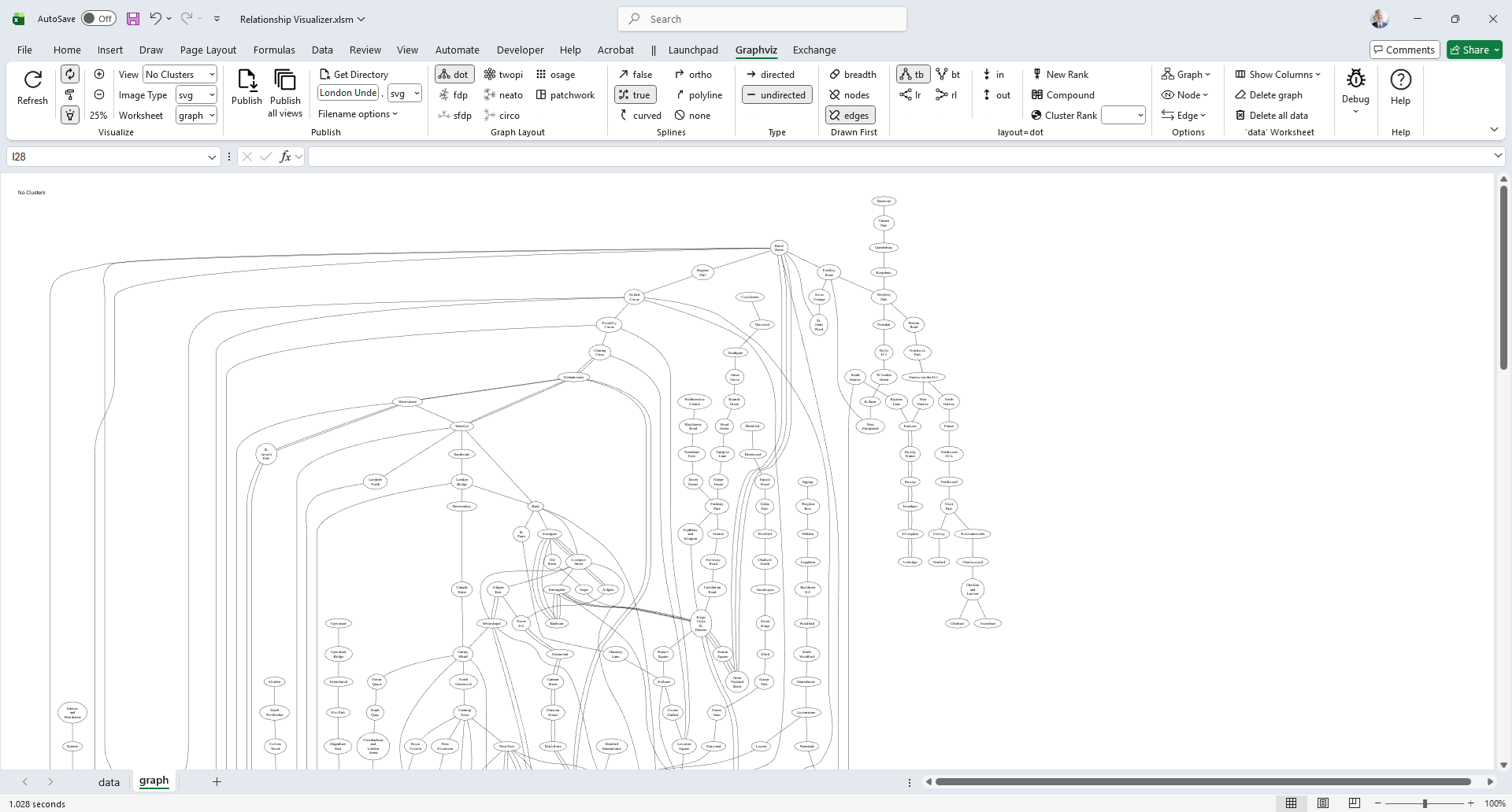
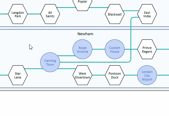
This graph depicts different areas of London, and the postal districts in which the stations are located.
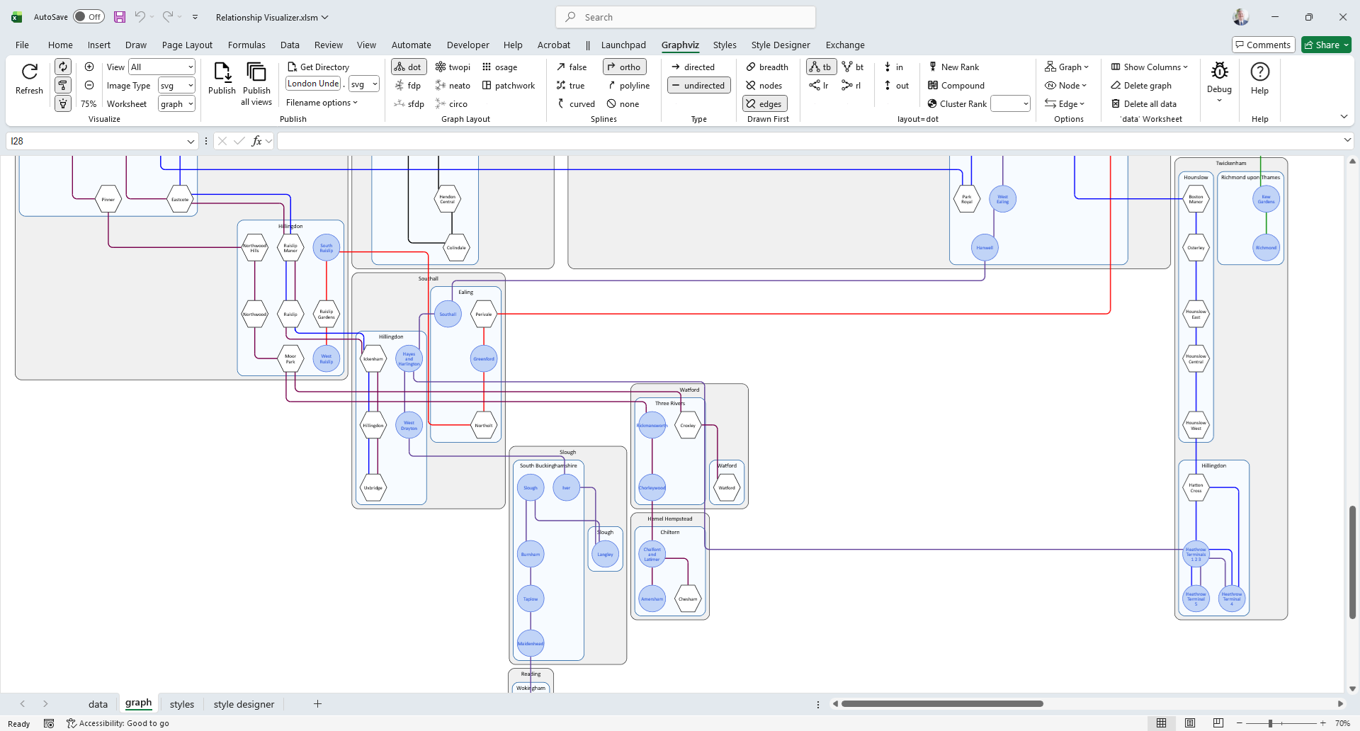
Split Data into Views
The Relationship Visualizer allows you to have multiple views of the same data by enabling or disabling styles on the styles worksheet. It generates graphs that include only the elements of the enabled styles.
In this example the styles worksheet modified to have one column per subway line, which only enables the styles for that subway line.
The column names appear in a View dropdown list on the Graphviz tab. Selecting a view name redraws the graph to include only the styles where a value of yes is present in that column.
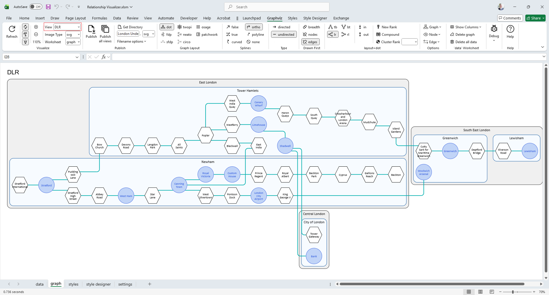
In the image below, selecting the "DLR" subway line from the View dropdown highlights the areas of London served by the DLR and its stations, while filtering out the rest of the London Underground.
Publish Graphs
Graph to File
Once you have created a graph to your satisfaction, a push of a button creates the graph as an external file.
You can publish graphs in the following formats: bmp, gif, jpg, pdf, png, ps, svg, tiff, json, dot
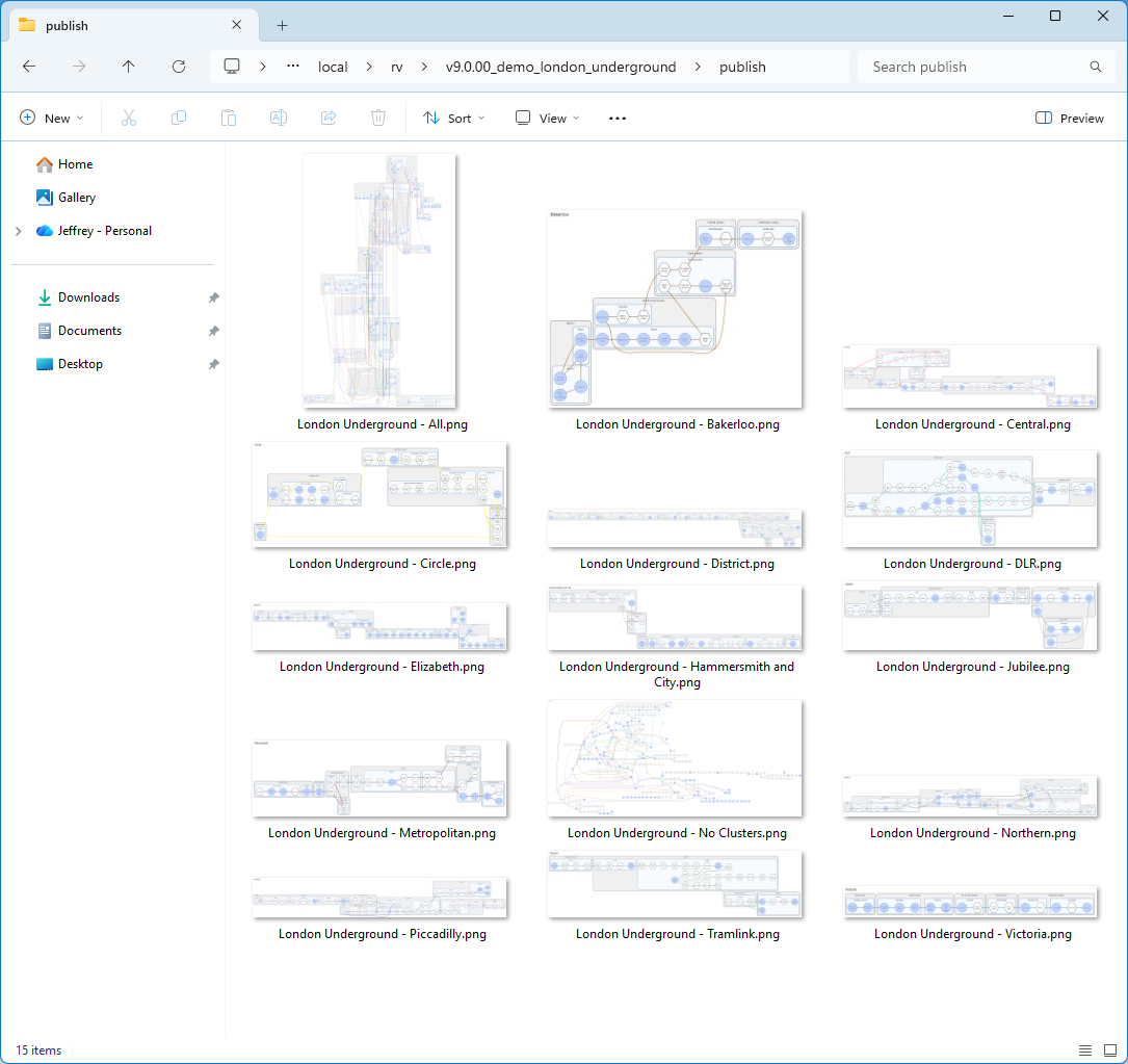
Publish All Views to File
You can publish a single graph, or use the Publish all views button to automatically cycle through all the view names, publishing each view as its own file. In this example, Windows Explorer displays the results after all the various London Underground lines have been published as graphs.
Enhance SVG Output
SVG, or Scalable Vector Graphics, is an XML-based file format used for creating and displaying vector images that are scalable to any size without losing quality.
Add Tooltips
The Relationship Visualizer provides a tooltips column where you can provide information to be added to the graph to be displayed when a cluster, node, or edge has the mouse hover over it.
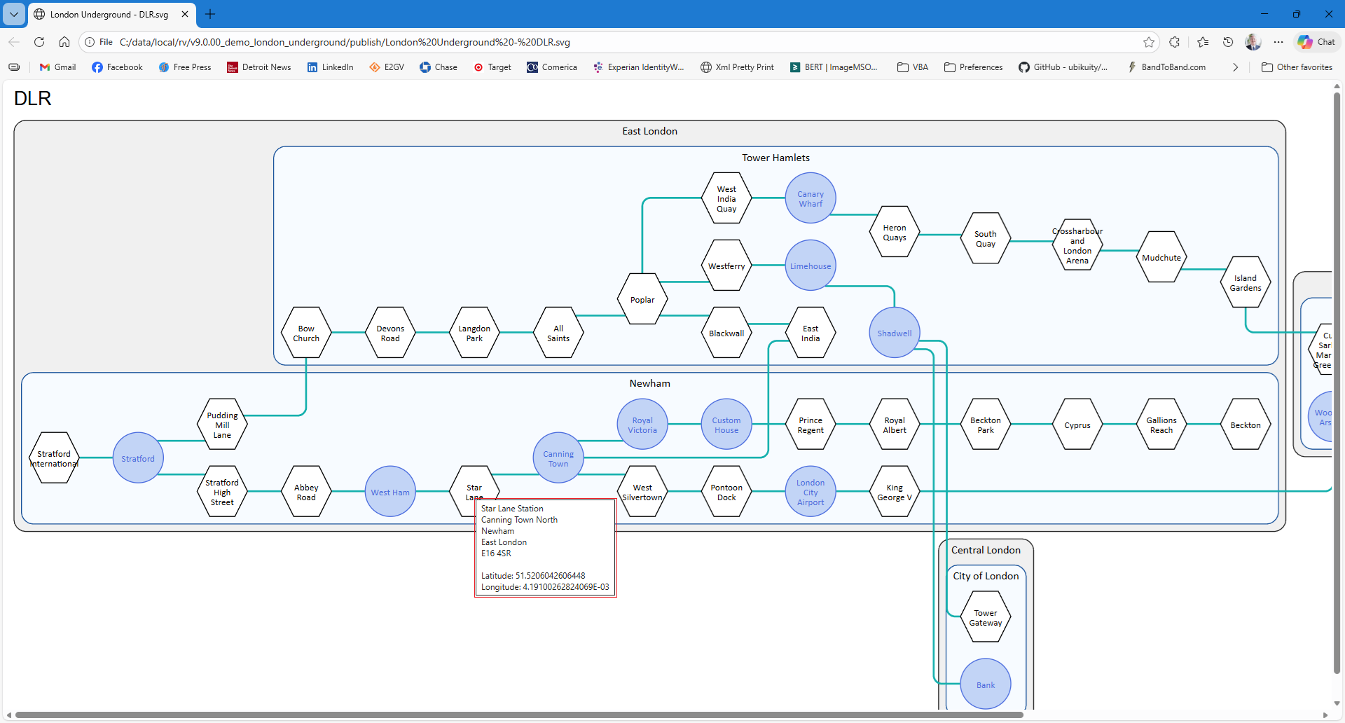
In this example, we see a graph of the DLR Line exported in SVG format. When hovering over the Star Lane station, a pop-up displays its village, district, postal code, latitude, and longitude.
Add Animation
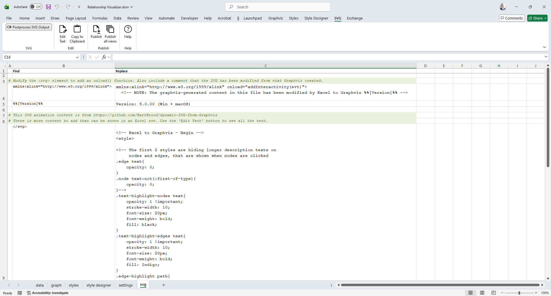
The Relationship Visualizer provides simple post-processing support via a worksheet which can perform find/replace actions against the XML content. Out of the box the Relationship Visualizer can post-process SVG to insert JavaScript routines for add animation capabilities.
The svg worksheet containing the find/replace strings appears as follows:
After post-processing (triggered by graphing to a file), we see that buttons have been added to the SVG file.
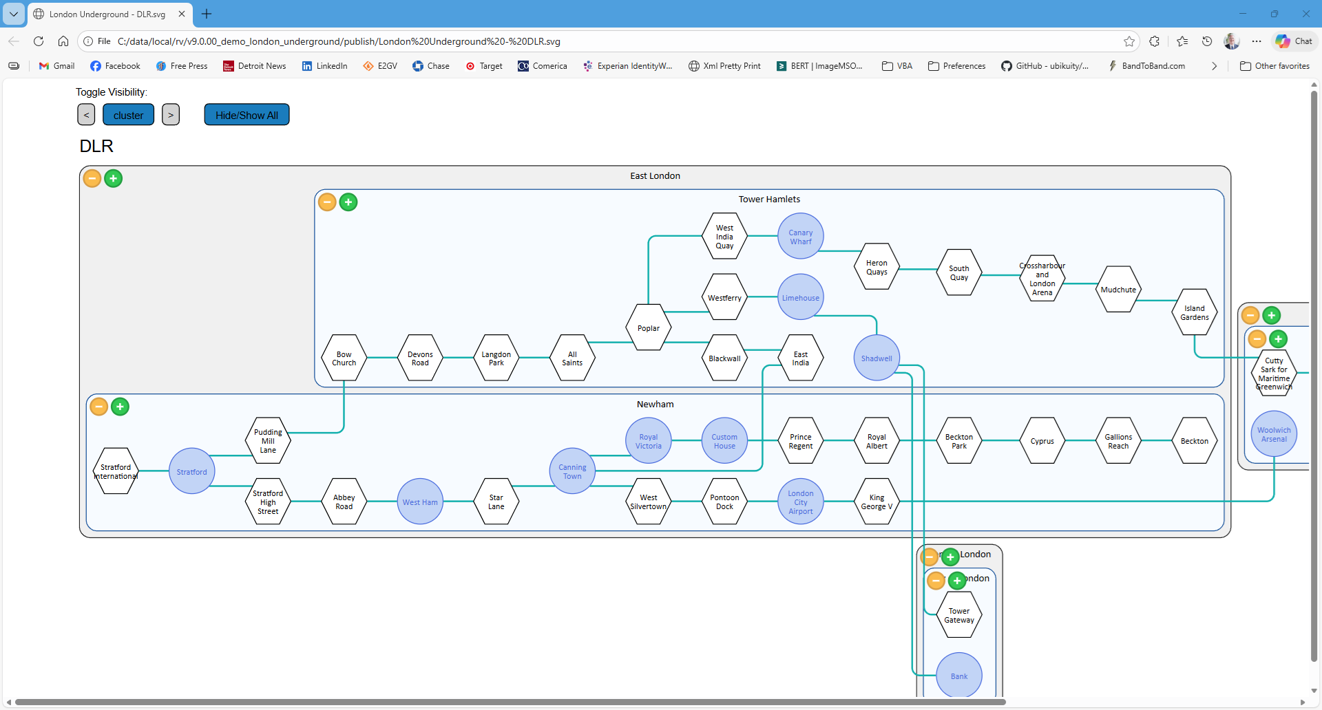
And in the animation below, we see how clicking a node triggers an animation to enlarge the node, and animate the edge connections from the node.
SQL Data Import
Typically, Excel data worksheets are created manually or exported from other applications. With the Relationship Visualizer, creating large graphs from these datasets is straightforward, as it supports importing data from other Excel workbooks and Access databases using SQL.
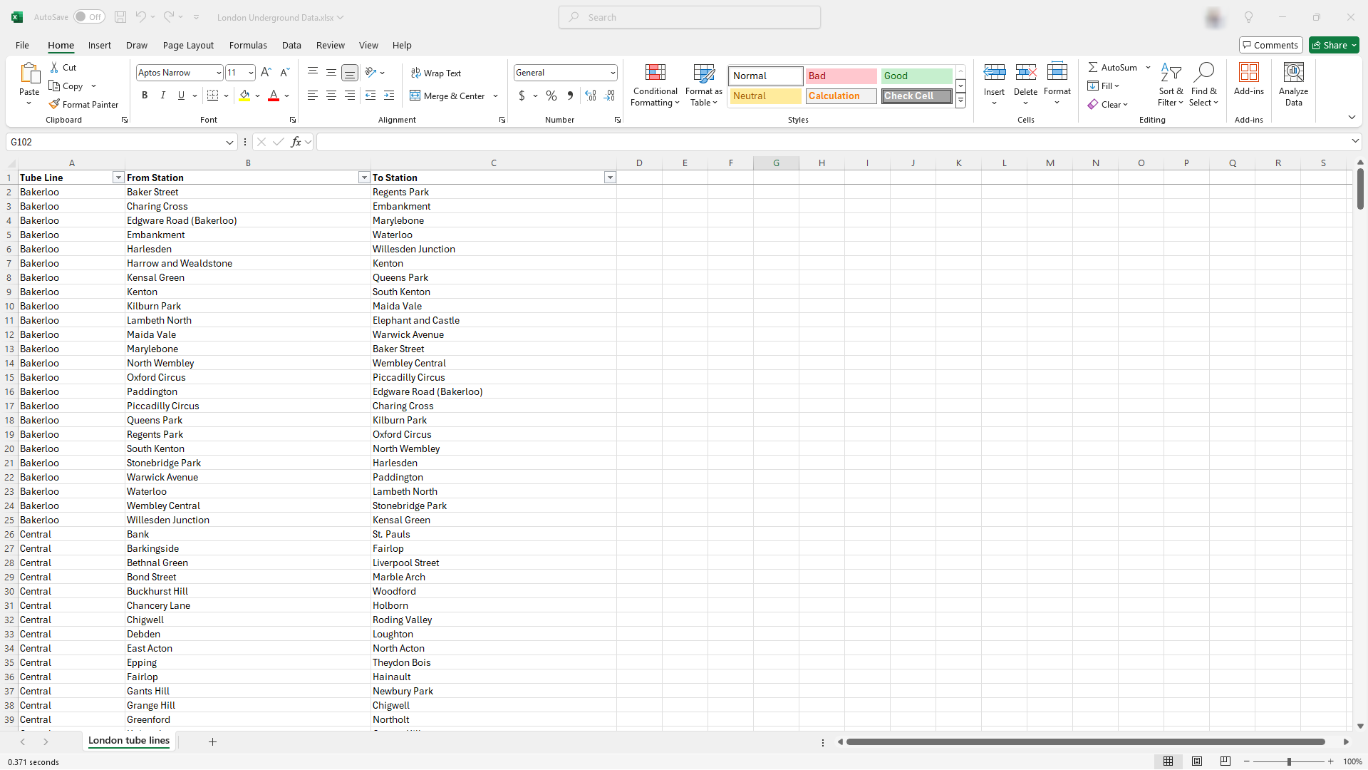
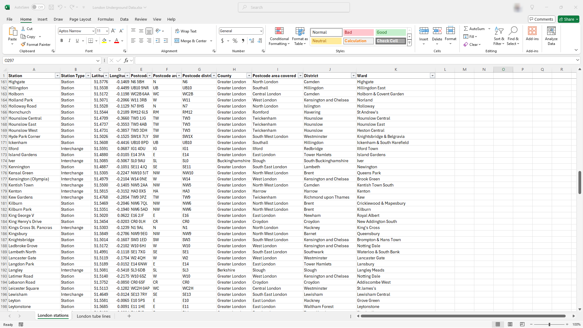
In our London Underground example, we have a London Underground Data.xlsx workbook containing two worksheets.
- A
London tube linesworksheet details which stations connect on each tube line. - A
London stationsworksheet provides detailed information on each underground station.
They appear as follows:
We write a SQL statement to extract data for edge relationships:
SELECT [From Station] AS [Item], [To Station] AS [Related Item], [Tube Line] AS [Style Name]
FROM   [London tube lines$]
And we write a SQL statement to extract data for nodes.
SELECT [Station] AS [Item], [Station] AS [Label], [Station Type] AS [Style Name]
FROM   [London stations$]
The sql worksheet in the Relationship Visualizer appears as:
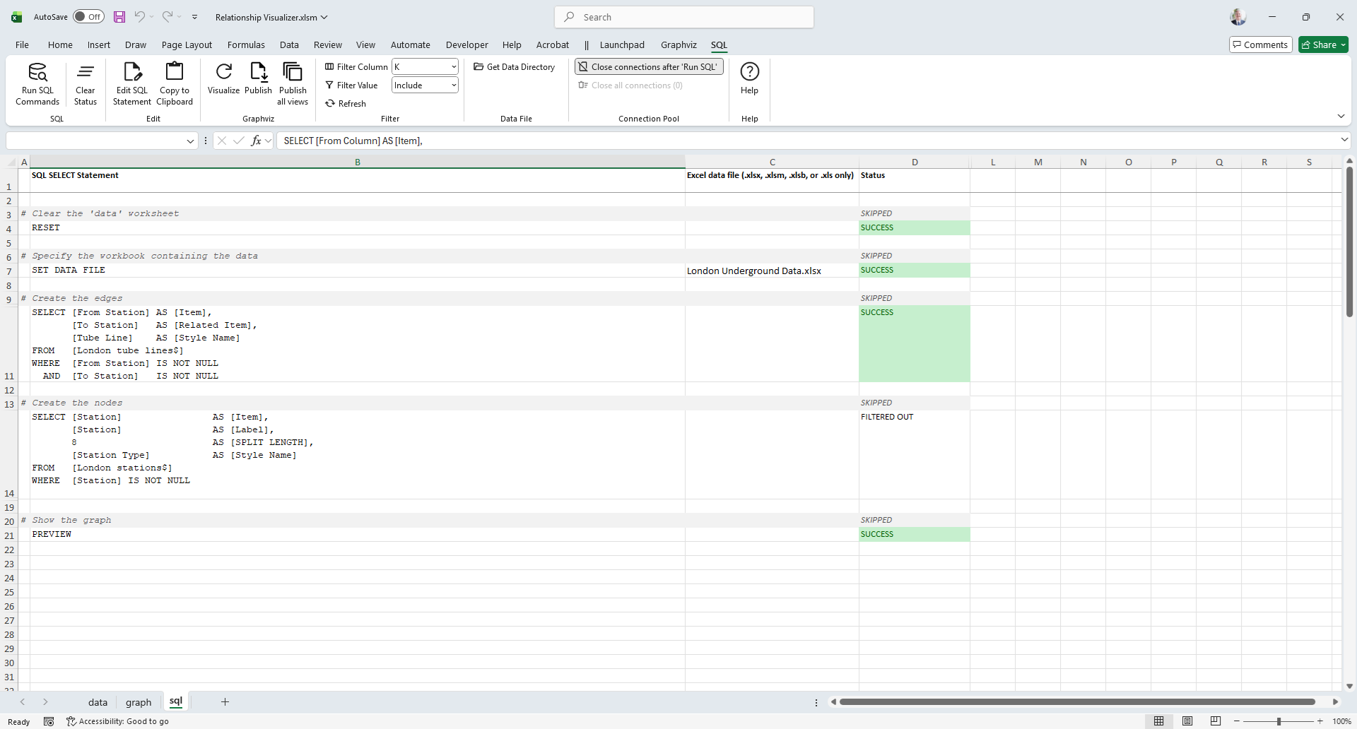
Pressing a button executes the SQL statements, which import the data and map it to the appropriate columns for visualization. It really is that simple!
JSON Export/Import
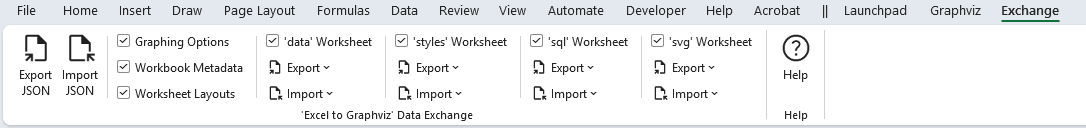
The Relationship Visualizer provides capabilities to generate a text-based representation of the data, styles, and settings in a JSON format. The features supporting the export and import of spreadsheet data are found in the Exchange workbook tab.
Learn the dot Language
The Relationship Visualizer includes worksheets designed to help you use Graphviz effectively.
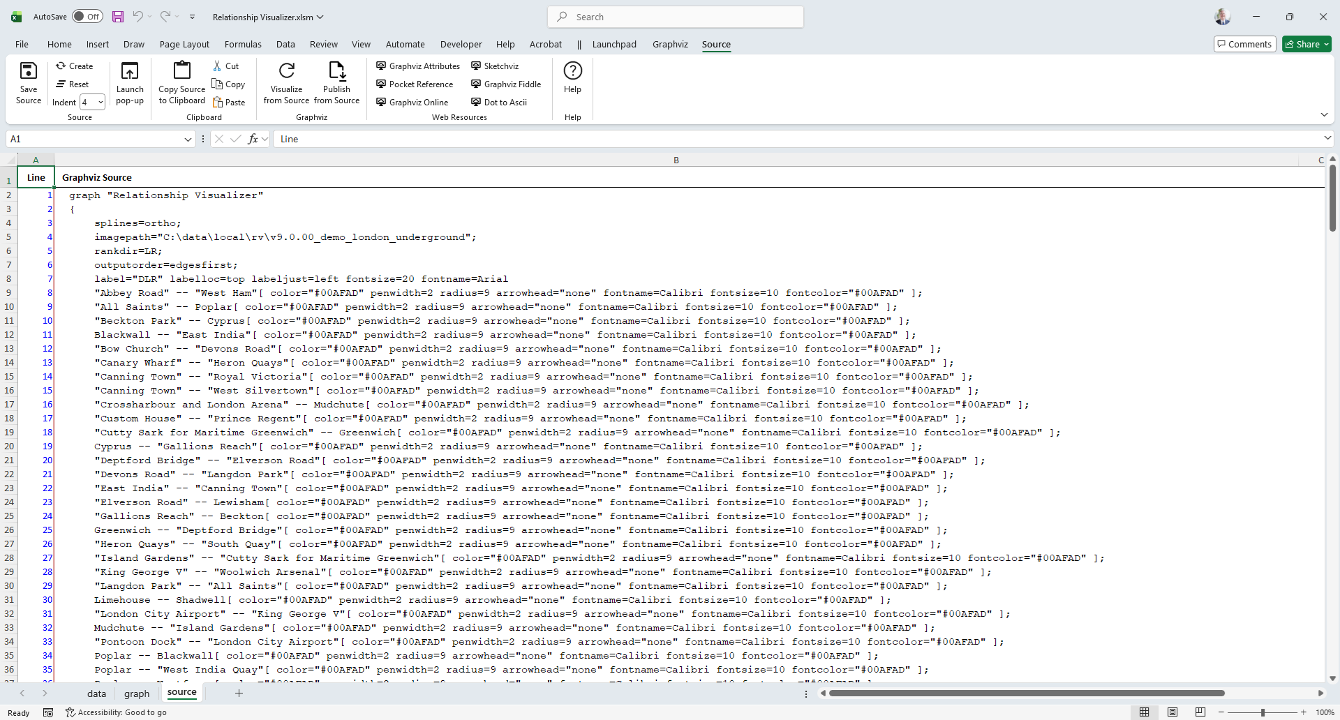
View/Save dot Source Code
The Relationship Visualizer includes a source worksheet that displays the dot source code generated from the data on the data worksheet.
You can save this source code to a file or copy it to the clipboard for use in an external Graphviz tool. Links to multiple external Graphviz websites are also provided.
An example appears as follows:
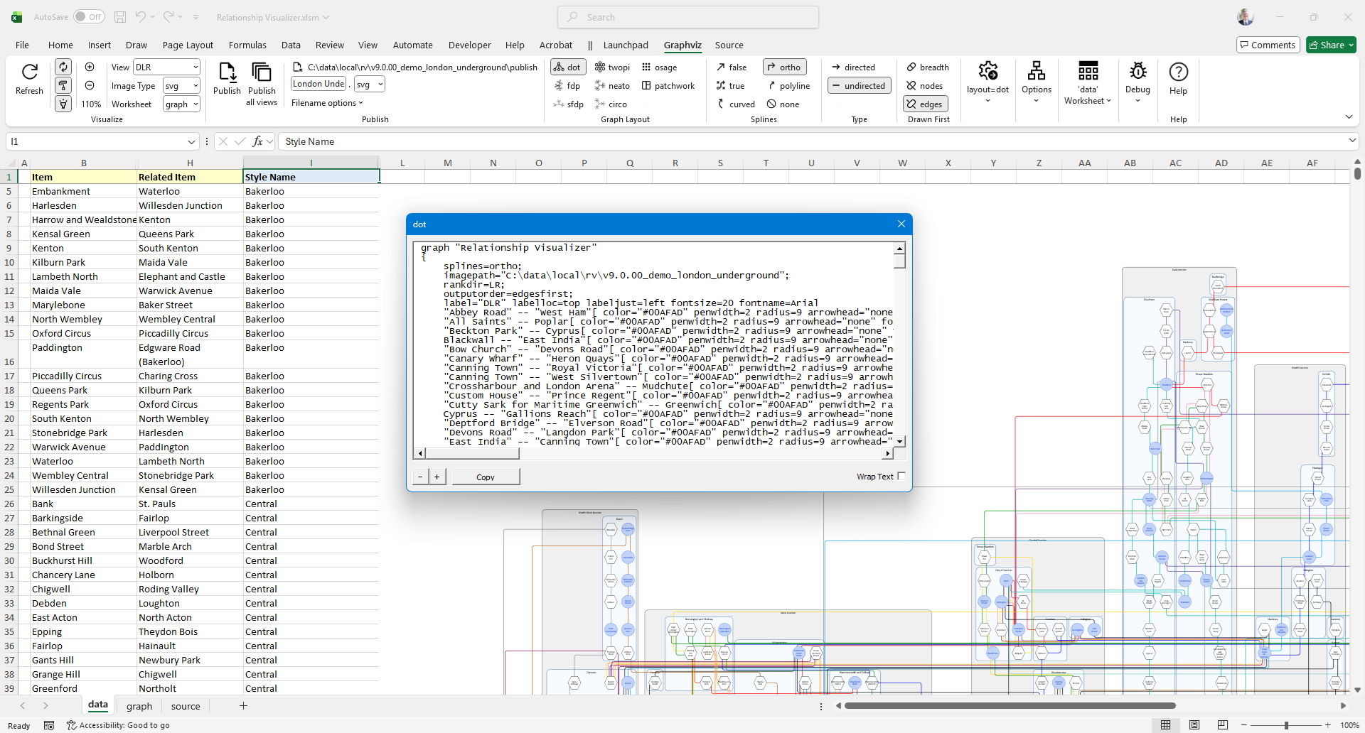
A pop-up source window can be launched, enabling you to view the source while simultaneously examining your data or graph. Below is an example of the source displayed in the pop-up window.
Learn dot Attributes
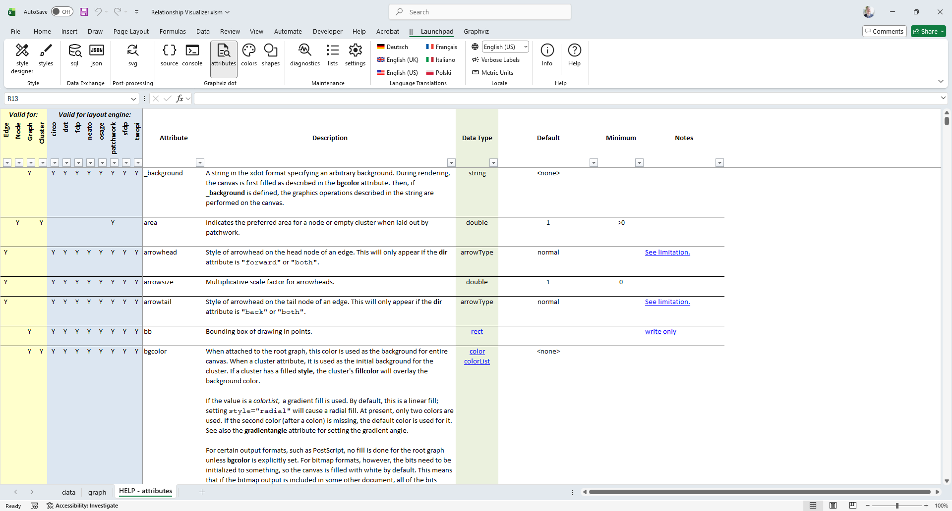
The HELP - attributes worksheet provides a list of the dot attributes along with columns which can be filtered by layout (dot, fdp, etc.), and attribute type (node, edge, graph).
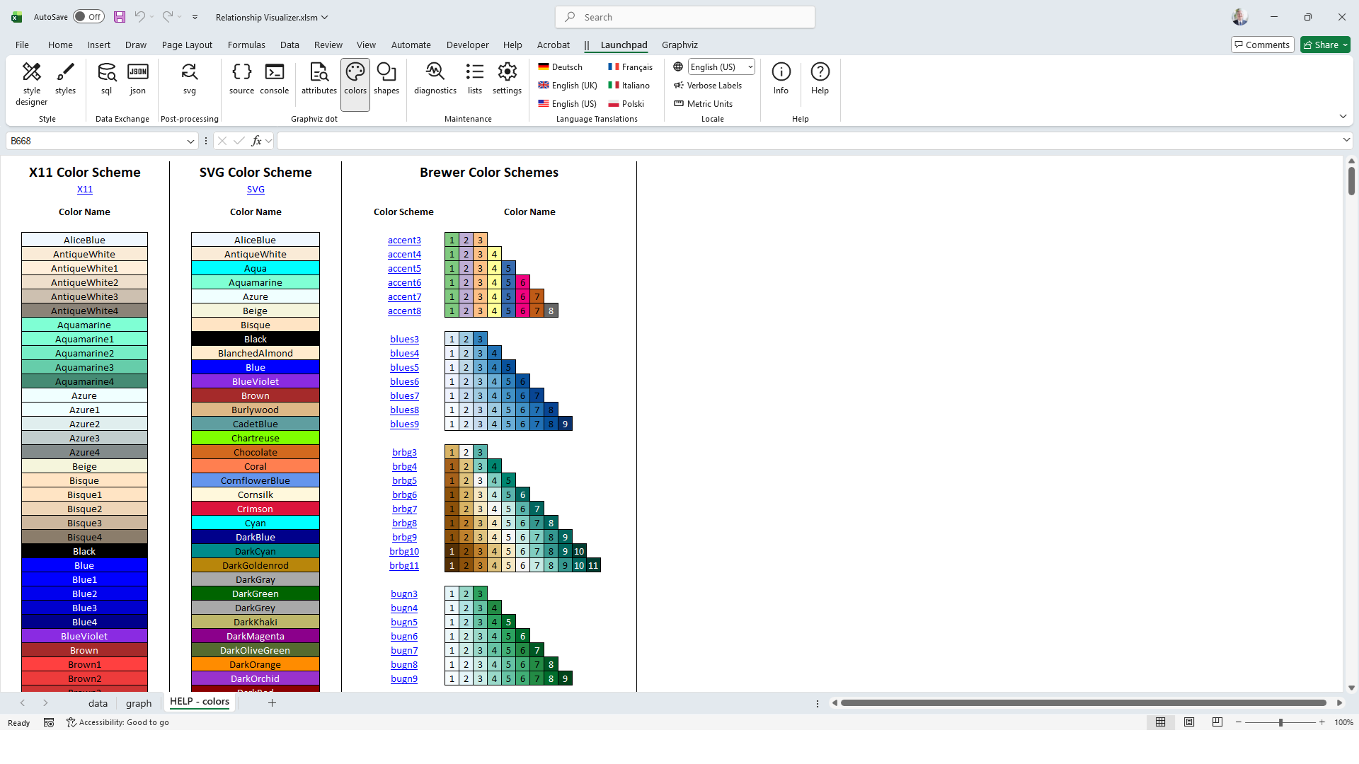
Learn Colors
The HELP - colors worksheet provides a visual reference of all the color schemes and colors which Graphviz supports.
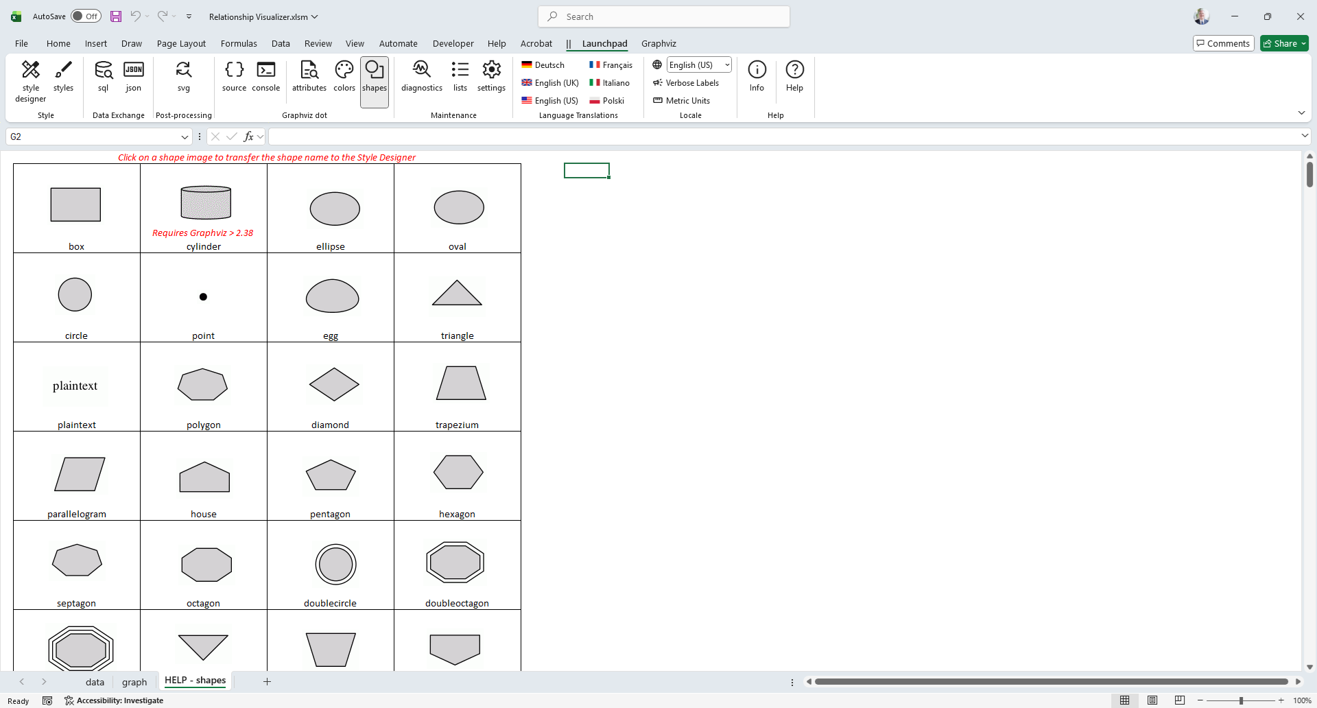
Learn Shapes
The HELP - shapes worksheet provides a visual reference of all the node shapes which Graphviz supports.
Diagnose Problems
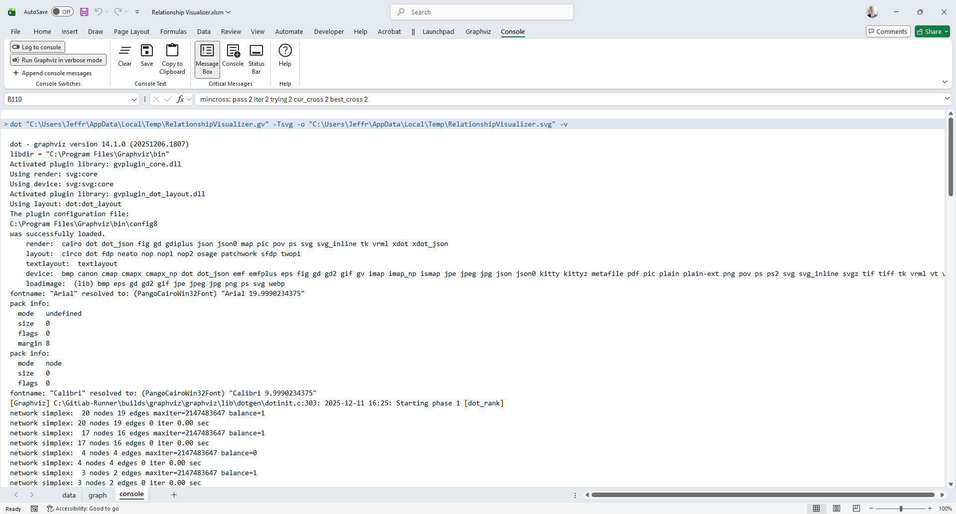
View dot Command-line Messages
dot is the Graphviz command-line program that the Relationship Visualizer utilizes to generate graphs. A console worksheet is available, which can be activated to display the output of the dot command.
In the example below, dot has been executed in verbose mode. The console worksheet displays dot's diagnostic messages. Notably, the node warnings indicate that two nodes have very long labels exceeding the fixed width of the shape used to depict stations.
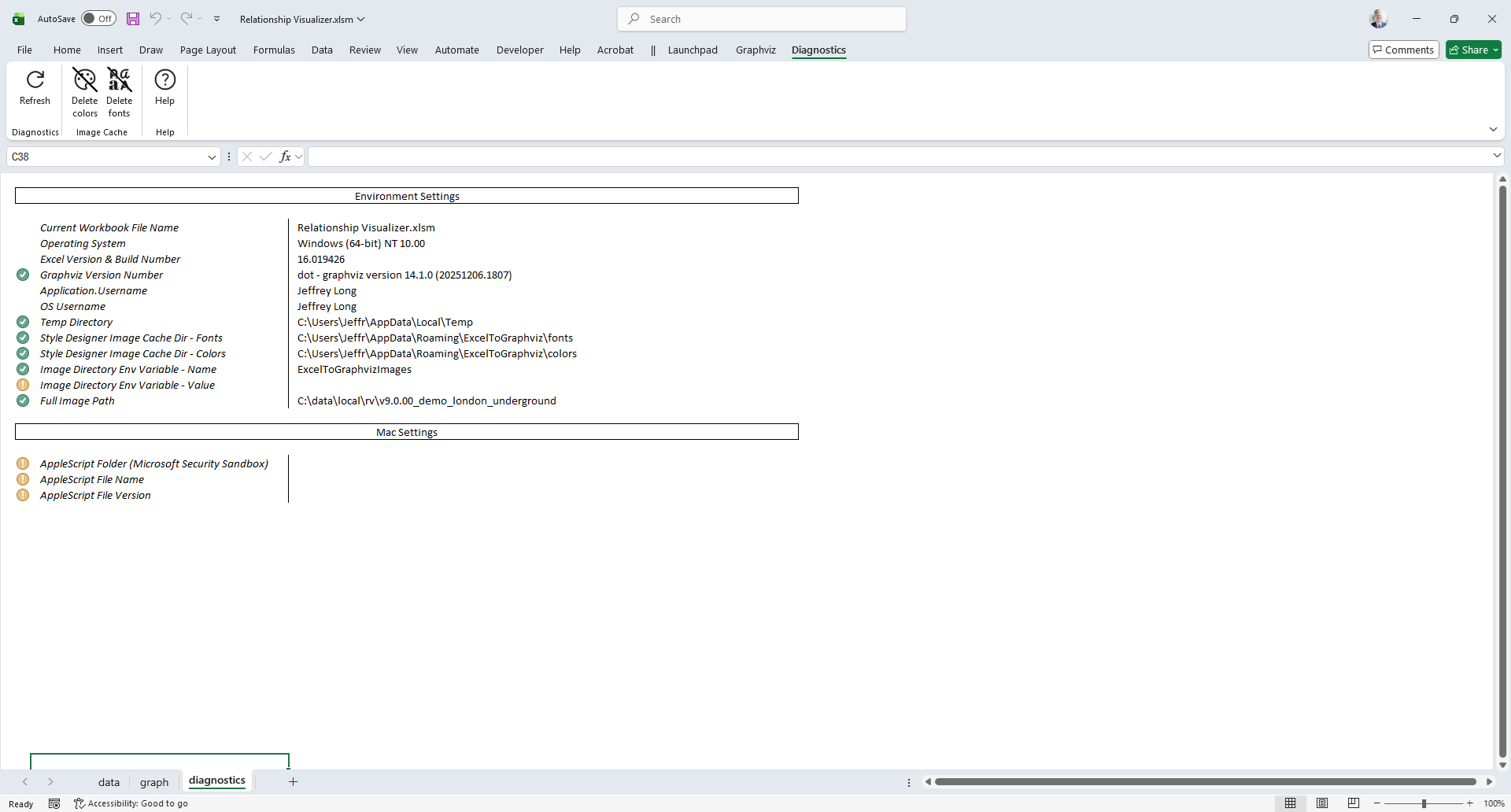
View Diagnostic Information
The Relationship Visualizer includes a diagnostics worksheet that provides essential information on software versions and directory paths, useful for troubleshooting and addressing questions.
Internationalization
The Relationship Visualizer supports multiple languages, and measurement units.
Set Your Language
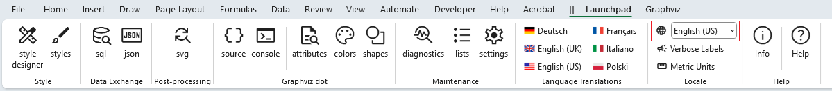
The Relationship Visualizer provides the following language translations:
- English (UK)
- English (US)
- French
- German
- Italian
- Polish
Simply pick your desired language from the Launchpad ribbon tab.
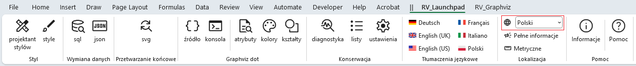
For example, changing the language to Polski (Polish) makes the Launchpad ribbon tab appears as:
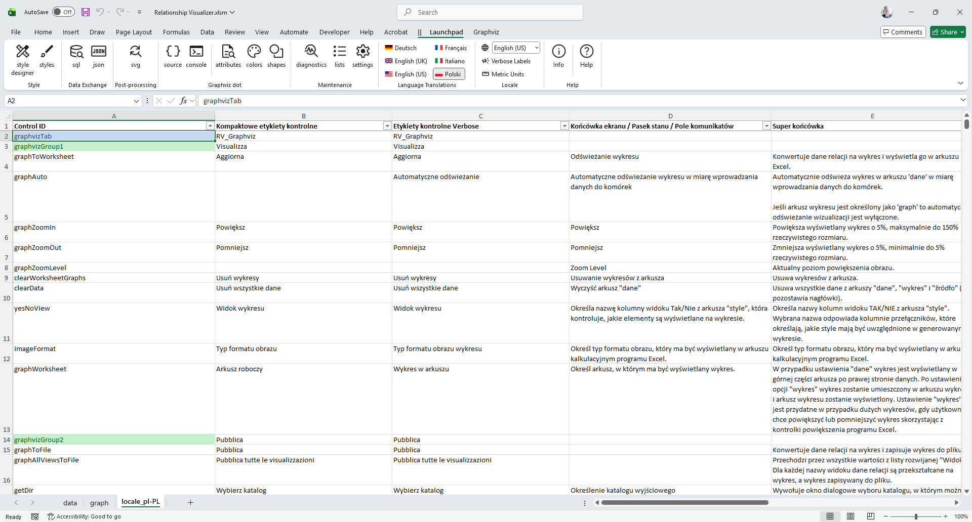
Edit Language Translations
Translations were performed by machine and may contain minor errors. Fortunately, all language translations are contained in worksheets. From the Launchpad, you can unhide the appropriate worksheet and edit the translation as needed.
Set Measurement Units
Graphviz uses inches as its unit of measurement for shapes. The Launchpad will let you choose Metric units for style designer dropdown lists. When Metric Units are chosen, measurements in dropdown lists are presented in centimeters, and converted to inches when passed to `dot'.
Information and Acknowledgements
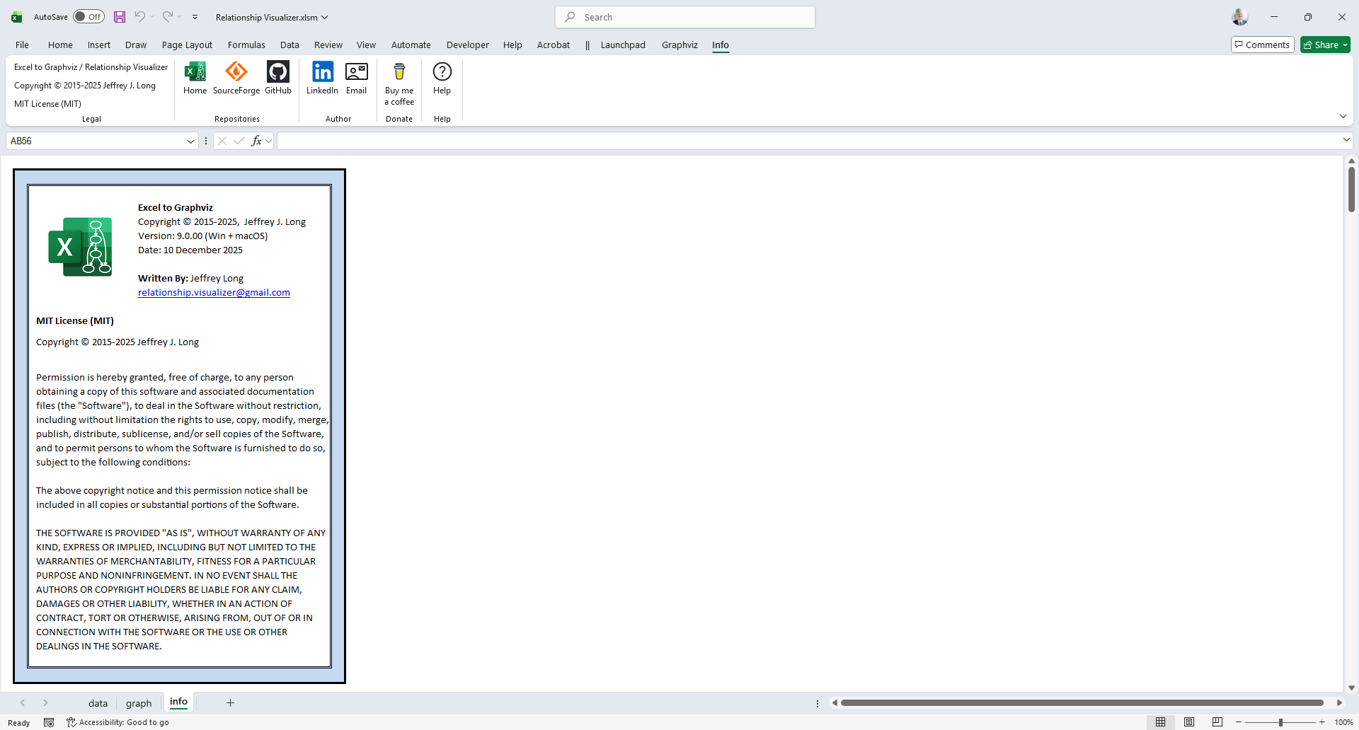
info Worksheet
The Relationship Visualizer includes an info worksheet that provides details about the spreadsheet, the internal technology incorporated into the tool, and the associated open-source licenses and acknowledgements needed to reuse the open-source components in a license-compliant manner.
About...
Copyright, Author, Repositories, and License information are available on this website here.
Thank You
Special thanks to key contributors are acknowledged on this website here as well as in the info worksheet.
Third-Party Notices
Open-source licenses and acknowledgements required to reuse the open-source components in a license-compliant manner are available on this website here as well as in the info worksheet.