Style Gallery
A key component of the Relationship Visualizer is the styles worksheet, where you can create style definitions for nodes, edges, and clusters. Conceptually, it works much like an HTML Cascading Style Sheet: you define a style name and specify how that style should appear (shape, color, font, and so on). Once defined, a style can be applied to any number of nodes or edges in the data worksheet.
The styles Worksheet
The styles worksheet is accessed from the Style section of the Launchpad ribbon tab.
The default styles worksheet appears as follows:
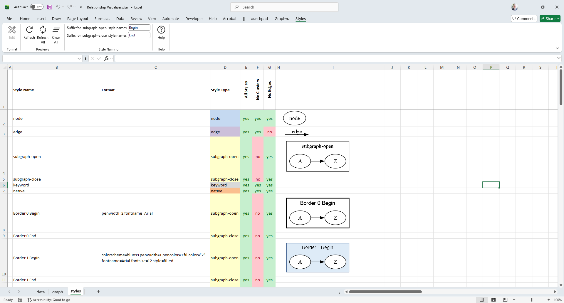
The data Worksheet has the following columns:
| A | B | C | D | E (and beyond) | Last switch column + 2 |
|---|---|---|---|---|---|
| Indicator | Style | Format | Style Type | View Switches | Preview Image |
The columns are as follows:
(A) Indicator
Allows you to place a # character to denote a comment. This can be used to comment out a style so it is excluded from the renderings.
(B) Style
Specifies the style name.
(C) Format
Contains the style definition pasted from the style designer worksheet. This definition determines the visual appearance of any graph elements associated with this style in the data worksheet.
(D) Style Type
Must contain one of the following values: node, edge, subgraph-open, subgraph-close, keyword, or native. This value tells the Relationship Visualizer macros how to interpret the row and convert it into the appropriate DOT language commands.
(E) View Switches
Used for creating different views of the data. Each column must contain Yes or No to indicate whether the style should be included in the graph. These columns are described further in Creating Views.
All spreadsheets created from the Relationship Visualizer Excel template include a default Column E labeled All Styles, with all style switches set to Yes. When this column controls the view, every style is included in the graph.
(I) Preview Image
A preview image of the style can be placed after the last view column. These preview images are generated using the Styles ribbon tab.
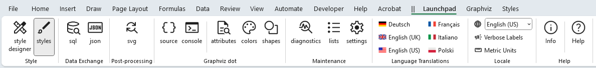
The Styles Ribbon Tab
The Styles ribbon tab is activated whenever the styles worksheet is activated. It appears as follows:
Windows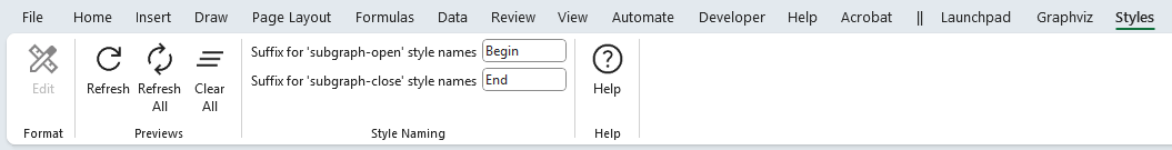
macOS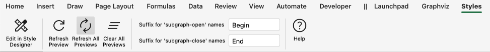
It contains the following groups, each of which is explained in the sections that follow. You may jump directly to any group using the links in this table:
| Group | Controls | Description |
|---|---|---|
| Format |  | Facilitates editing the style format. |
| Previews |  | Provides the action buttons for managing the style preview images on the Styles worksheet. |
| Style Naming |  | Allows you to specify the suffix for the end of the style name to denote when the cluster begins and ends. |
| Help |  | Provides a link to the Help content for the styles worksheet (i.e. this web page). |
Format
The Format group controls facilitate editing the style format.
|
|---|
| Label | Control Type | Description |
|---|---|---|
| Edit |  Button Button | The Edit button becomes enabled whenever a single format cell in Column C is selected, and the row defines a style for a node, edge or cluster. When pressed, the format string in that cell is parsed, and the resulting values are used to initialize the Style Designer worksheet, where the style definition can be edited. A second location where the Edit button appears is as a floating button on the right side of any selected format cell. This button displays a pencil icon, as shown in the following example: 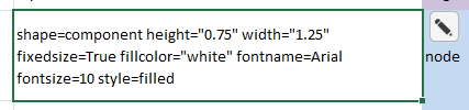 Clicking the pencil button performs the same action as selecting the Edit button in the Ribbon. |
Previews
|
|---|
The Previews group provides the action buttons used to manage the style preview images on the Styles worksheet.
| Label | Control Type | Description |
|---|---|---|
| Refresh | Button | Creates a new preview image for the current row. This is useful when you manually modify a single style definition and want to see the updated appearance. |
| Refresh All | Button | Deletes all preview images on the styles worksheet and generates a completely new set. This is useful when you make a bulk change to all style definitions, such as updating a font name or size. |
| Clear All | Button | Deletes all the images on the styles worksheet. |
Style Naming
|
|---|
Two rows are created when you use the style designer to define a style for a cluster. These settings allow you to specify the suffix appended to the style name to indicate where the cluster begins and ends.
The default suffixes are " Begin" and " End", but you may choose alternatives such as " Start"/" Stop" or " Open"/" Close".
These values are also used by the sql worksheet when emitting rows when CLUSTER and SUBCLUSTER clauses are used in the SQL statement. See the sql topic for more information.
Two rows are created when you use the style designer to define a style for a cluster. These settings specify the suffix appended to the style name to indicate where the cluster begins and ends. The default suffixes are "Begin" and "End", but you may choose alternatives such as "Start"/"Stop" or "Open"/"Close".
These suffix values are also used by the sql worksheet when generating rows for CLUSTER and SUBCLUSTER clauses in an SQL statement. For more details on how SQL-driven clustering works, see the Grouping Data into Clusters and Subclusters topic.
| Label | Control Type | Description |
|---|---|---|
| Suffix for 'subgraph-open' style names | Text Edit | Suffix to append to cluster names to indicated the beginning of a cluster. |
| Suffix for 'subgraph-open' style names | Text Edit | Suffix to append to cluster names to indicated the end of a cluster. |
Help
|
|---|
Provides a link to the Help content for the Info worksheet (i.e. this web page).
| Label | Control Type | Description |
|---|---|---|
| Help | Button | Provides a link to this web page. |